The Great Gatsby Trailer: Leo + Baz, Together Again

The first trailer for Baz Luhrmann's The Great Gatsby has arrived, and yup — this looks exactly like what Baz Luhrmann's Great Gatsby should look like: A richly stylized 1920s New York, Jazz Age nightclubs swirling with beaded flappers a la Moulin Rouge, star-crossed lovers exchanging torrid looks across impossibly polished sets, the anachronistic sounds of Kanye & Jay-Z & Frank Ocean... Not to mention Leonardo DiCaprio looking mighty fine in his first broodingly romantic role in over a decade. Soak up the moody art deco stylings and weigh in on Lurhmann's Christmas 3-D offering after the jump!
Everything about this trailer screams Luhrmann, and after a jarring initial viewing I'd say that's a good thing. Your mileage may vary, but after watching it over again a few times, I can't imagine seeing it any other way. Things I love the more I hit replay:
· The use of "No Church in the Wild" to open the trailer — I'm starting to think a little Watch the Throne would be strangely fitting if it made it into the actual film.
· The bright, hyper-stylized look of Baz Luhrmann's New York.
· Newcomer Elizabeth Debicki as Jordan Baker.
· Carey Mulligan as Daisy and the way she dangles that delicate cigarette like a weapon.
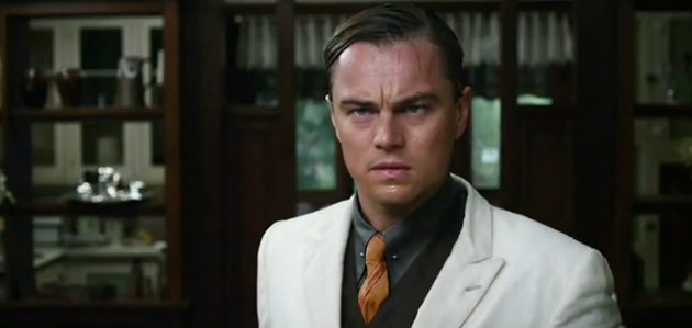
· The look on DiCaprio's face at 0:52.
· Joel Edgerton, even with that mustache.
Verdict: Looks so great I almost forgot Tobey Maguire's in this thing. Marking the calendar for Christmas 2012 anyway.

Comments
As someone on Twitter put it this morning: "Gatsby believed in the green light, even though it was 30% dimmer than it should have been and caused headaches and eye-strain."
I'm sorry, this film looks absolutely terrible and completely ridiculous. Can you imagine what Martin Scorsese could have done with the same budget and source material?
I agree, this looks awful, like most of Mr. Luhrmann's films.
So this is the latest fantasy we've chosen to replace the 1920s with? Just another big-budget glossy ad full of people and archetypes who never existed. I suppose I was foolish for hoping something more recognizably human would emerge. I'm sure the merchandising tie-ins will be wildly popular, so there's that.
Actually, I've heard that there's a Happy Meal tie-in already. Something to do with East and West Egg McMuffins.
Wow, all the glitz cannot overshadow the over-earnest emoting here. If you want a commercial tie-in how about a themed Dennys "Moon over my-Hammy" to go with the acting.
I agree, but it's worth pointing out that in almost all Lurhman films a lot of the acting is way over the top. You may not notice it as much in Romeo and Juliet because of Shakespeare's dialogue, but Moulin Rouge is completely full of it and Strictly Ballroom has a lot of scenery chewing as well by most of the smaller characters.
I'm on board to see this, but have some of the same reservations that others seem to have in this comment section. I thought Strictly Ballroom and Romeo and Juliet were masterpieces, but couldn't enjoy the ridiculous Moulin Rouge. This seems like it's somewhere between R + J and MR.
The thing I don't understand is where Gatsby's charm went. Maybe it's the holdover of Redford being soooo charming in the original, but reading the book, I never imagined Gatsby constantly scowling everywhere he went like appears to be the case with DiCaprio. I always saw the character as making the chip on his shoulder more subtle. But maybe the trailer just left out all the charming moments?
Jake,
Gatsby was never charming. Okay, maybe before he shipped off to war but that was more naivety. By the time he is throwing those wild parties, he was a complete thug. Made all his money through crime. Read the book carefully and you will see he was up to his neck with the Mob. Notice the guy in the trailer looming over his shoulder every now and then... Mob ties.
It's in 3D because...?
It's in 3D because more money.
Yawn, what a snoozefest.
If someone released a parody of what they thought Luhrmann's version of "Gatsby" would be, it would be... exactly the same as this. Expecting restraint would be highly optimistic at this stage.
And yes, I mean optimistic. Coo all you want over Luhrmann's stylistic excesses; they look great in a trailer but run out of steam in, oh, about 20 minutes. Then you'll wait and wait and wait as Luhrmann beats on, boat against the current, borne ceaselessly back up his own ass.
So well said! What's more, he expects you to take his embrace of 3-D at face value, as though this is the tool that will finally make his visual palette intelligible. He's a fraud.
Excellent beat ! I would like to apprentice while you amend your site, how could i subscribe for a blog website? The account helped me a acceptable deal. I had been a little bit acquainted of this your broadcast offered bright clear concept
Nice site. I’m jealous. Save the ferrets!!