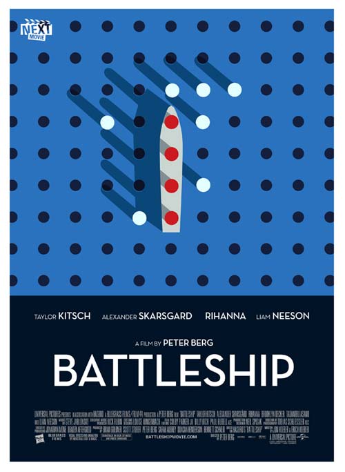
Indie Battleship Poster Way Better Than Studio Battleship Poster
I never thought I'd say this after such dubious product partnerships and horrid early reviews, but: I think I've found some marketing that might actually make me want to see Battleship! It's not from Universal or Hasbro, alas, but it's not too late for either party to maybe pick it up for the last push ahead of May 18.
NextMovie actually designed 10 indie-style posters for this summer's biggest titles, but I'm fondest of this one, which would go very well next to my rare, Edvard Munch-style reimagining of the terrifying What to Expect When You're Expecting one-sheet:


Comments
Honestly, no. It's a wonderful poster – if the goal was just to make a wonderful poster. But that's not the only goal. It shouldn't even be a primary goal. The primary goal of a movie poster is to sell a movie. That poster does not sell the movie. Now, before I go further, I have no interest in seeing this movie. That said, this movie has a very clear, broad audience, and that audience won't look at the above poster and respond to it by saying, "Wow, what a nice poster. I bet it's the type of huge, action-packed blockbuster I love to see at the movies." If they know nothing about the movie, they're going to go, "Oh, that's interesting," and walk right by it. You market a mediocre blockbuster like this with a mediocre action movie poster. Because it works. Because it's smart. That's not to say there aren't opportunities to take more design risks with blockbusters (like "The Dark Knight Rises," for example), but "Battleship" isn't the movie you do that with.
Are... are you serious? I can never tell on the internet anymore?
I say next they should go the opposite direction: massive hype-posters for independent titles. "The Five Year Engagement" would have laser graphics and massive airbrush effects. The Mylie Cyrus "LOL" would HAVE to display at least 2 fireballs.
Wait. This is really happening? I thought it was some kind of April Fools Day joke.