Are the New X-Men: First Class Posters Really That Bad?
With the exception of the teaser trailer, the marketing for X-Men: First Class has been -- thus far -- underwhelming. As director Matthew Vaughn told /Film about the initial character photos, "I said, 'What the f*ck is this sh*t,' and Fox is running around trying to figure out what happened as well. [...] It's like a bad Photoshop, which maybe it was by someone. It didn't reflect the movie." Which brings us to the latest posters released by the studio. Photoshopped? Yes. The "worst studio-released posters of the year," as some on the interwebs are saying?
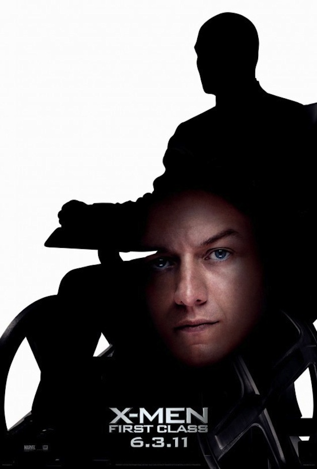
"Yes!" you shout, chuckling at your monitor. OK, I get it: the Photoshop job could have been more elegant, but these aren't on the level of The King's Speech. Or even Dead Awake. For starters, the silhouette concept is pretty cool, and I can at least wrap my head around the floating head crotch shots -- you don't cast good looking actors like Michael Fassbender and James McAvoy and relegate them to the shadows. Get those mugs out there! Of course, another head shot or two of each actor would go a long way to making future First Class posters slightly more appealing, but still: Not terrible!

[via /Film]
 Subscribe to the new Movieline on YouTube
Comments
Don't be fooled. As always, FOX HAS AN AGENDA. Using ultrasound photos to show the X-Baby's fully formed facial features and 5 o'clock shadow is just another way of saying "ABORTION IS NAUGHTY, Y'ALL!"
I must disagree; they are that terrible.
As a graphic designer who would love nothing more in life than to design movie posters and a huge X-men fan, these truly make me upset on a primal level. I can say in all seriousness that these are probably the worst posters for a studio movie I have ever seen. I am shocked. I want so badly to design a REAL poster for this movie. Please, please, please let me do it. I promise no floating heads. Why has no one considered a "throw back" 60's-style poster for this movie? Wasted opportunity
Great point -- while I don't hate these posters, a throw back '60s-style one would be lights out. Especially since the entire movie is supposed to be a throw back. Win.
It's funny how you still see awful Photoshop like images attached to major motion pictures. Even some DVD releases have cover art that a third grader could have done.
I am also a Graphic Designer for 5 years now, and I honestly think that it is pretty nice. To the average joe, they do not understand the beauty in the simplistic/minimalistic look. I personally like a "Cleaner" look and sometimes if a Designer uses White Space, it can make a Huge impact. My personal favorite is the silhouette of Professor X. Because the lines and details are so prominent, and makes the right impact. I think the one on the top should have been a silhouette of Wolverine or something, with the claws showing, etc. It would make MUCH more of an impact. It's kind of like the average joe wouldn't mind a microwave, or fast food meal, as a "foodie" would not.
With all this being said, the designers needs to Design for the TARGET MARKET of the movie, and I don't think he did it appropriately. This is a movie known for the Bright Colors, and Special Effects. So nice poster, wrong Target Market.
Why would they have an image of Wolverine when he's not in the movie? The point of the poster is that the disembodied head is going to grow up to be the shadow.
Also, yes, these are literally the worst posters I've ever seen. I almost expect another announcement soon about how these were faked also. The incongruity between the two types of images used is stunningly amateur. Someone needs to get fired.
Roy that is Magneto's silhouette, not Wolverine's. But I agree with you about the posters. Dane is on the right track.
I know it's Magneto. That's what I'm saying. Jessica said they should have used Wolverines silhouette, with a pic of Fassbender hovering over it, which wouldn't have made sense.
I did a redo. Not great, but better than the real ones.
http://www.ericshawn.com/ericshawn/images/x-men_poster.jpg
go to the marvel.com homepage to see the real posters. these other ones that leaked on the internet are obviously unprofessional and not the actual movie posters, duh, just fb pics. thanks to yahoo "news", medialine, and many others for distorting the truth like every other know media conglomerate.
as one graphic designer to another, you have to realize that these posters are awful and this is coming from someone who loves the silhouette look. these posters however are very amateurish, which you can tell by the rough lines on the parts that should be smooth and straight (the helment & the arm of the wheelchair). the faces coming out of the crouch is the worse part, it makes the whole thing unintentionally funny. the better way to execute this concept would have to have the face encompass the whole silhouette or better yet a full figure shot of the actors masked within the silhouette.
Robert DeNiro is right on about Donald Trump. What a joke!
http://www.cinemovie.tv
Oops! Wrong post.
Posters aren't so bad but does need some color in the background.
The weakest links in the whole film are the bad guys. While Kevin Bacon’s Sebastian Shaw comes off as utterly horrifying and creepy in the film’s opening sequences, he borders on cartoonish by the film’s end.
The weakest links in the whole film are the bad guys. While Kevin Bacon’s Sebastian Shaw comes off as utterly horrifying and creepy in the film’s opening sequences, he borders on cartoonish by the film’s end.