Twilight and Photoshop, Forever: A Brief History of Weird Posters
The marketing blitz accompanying this week's Breaking Dawn release has prompted a bit of nostalgia about The Twilight Saga around Movieline HQ -- particularly its eminently intriguing movie posters. Gone is the quaint patina of the original 2008 film, with sultry, semi-known Robert Pattinson locking his poo-colored gaze and clay-like visage on virginal, vaguely known Kristen Stewart, both doctored with minimalist Photoshop fervor. But gone, too (for now, anyway), are the hilariously earnest, carefully manipulated one-sheets from New Moon and Eclipse -- the hand-mangling, the cock-blocking, the stank-eyed cast of thousands. In fact, the newest posters look like photographs of actual people! Very attractive and heavily airbrushed people in romance-novel clutches, but people nonetheless. Join Movieline's Dept. of Marketing Forensics in looking back on how we got here.
[Click the images for bigger sizes.]
TWILIGHT
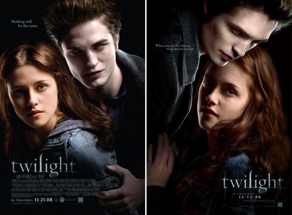
Remember the innocent days of summer 2008, when Twilight was but a young-adult literary phenomenon from which Summit Entertainment hoped to launch an equally phenomenal movie franchise? It all started with these:
And it was, well, a little raw by the standards to come. Two taglines, two release dates, and two relatively organic Edward/Bella poses photographed by 18-year-old wunderkind shooter Joey Lawrence. But it cast the die early for Edward's otherworldly wet-cement pallor that would take a multitude of Photoshop-enabled variations to come.
NEW MOON
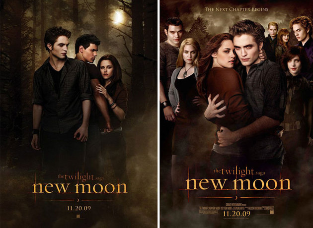
Shit got real here. Well, not real, but you know: The blockbuster sequel doubled the poster count, mixing in the full ensemble that fans came to know in love in the first film and then cramming said ensemble into a sepia-toned mishmash of goofy stares and $300 haircuts. It was hard for us at Movieline to determine which was more confounding: Who exactly was getting cockblocked from whom in the poster below left (note the smoldering tension between Edward and Jacob), or what exactly was going on with Robert Pattinson's stunt hand in the the poster above left.
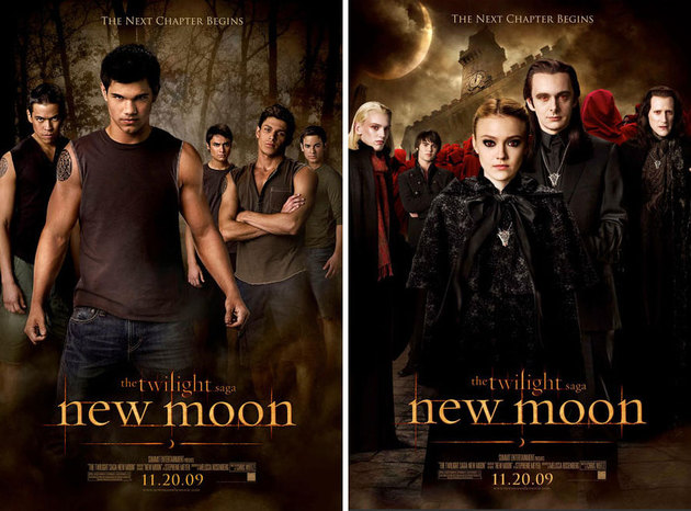
But the jaw-dropping breadth of the Twilight audience dovetailed nicely with the expanded breadth of the story in New Moon, requiring posters that courted both the wolfcake-craving and goth-positive viewer who couldn't care less about the love triangle.
Airbrushed Oiled biceps and magic-wand-abetted scary scarlet eyes would not be enough, however. It would be crucial to photograph each separately and layer them as crudely as possible, with folded-arm poses and post-Halloween clearance-sale makeup giving way to the likes of Taylor Lautner, Dakota Fanning and Michael Sheen. I particularly love the edifice sloping into the frame like some kind of Sears Portrait Studio backdrop of the damned.
ECLIPSE
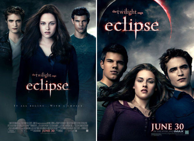
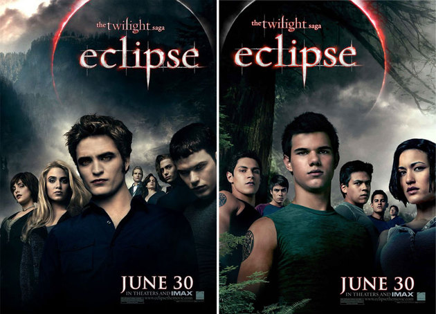
Having spiraled into a $500-per-day simulacra habit by the time Eclipse's marketing campaign came along, Team Twilight stopped at nothing to conceive the most vaguely human renditions of their young stars as possible. Stewart got out mostly unscathed (there simply is no technological means of achieving such daftly parted lips; that one's all K-Stew), but Pattinson and Lautner look like Henson Workshop castoffs who'd stalk Joan Rivers in her worst nightmare.
And the binge continued in the group posters, with more scowls and shadows than a used car lot at sundown. Pattinson cracks me up. Those lips! Those eyes! That hair! That whole distended head.
BREAKING DAWN
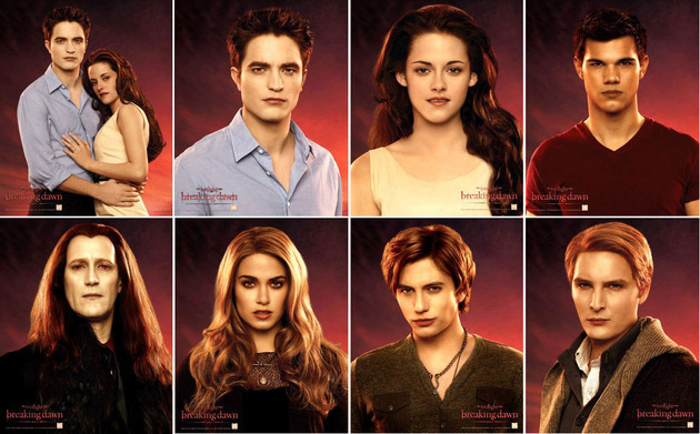
The first one-sheet -- an anticlimactic shot of what can only be described as an honest-to-God breaking dawn -- soon gave way to a bonanza of character posters that were part Glamour Shots, part mug shots, all LOLZ shots:
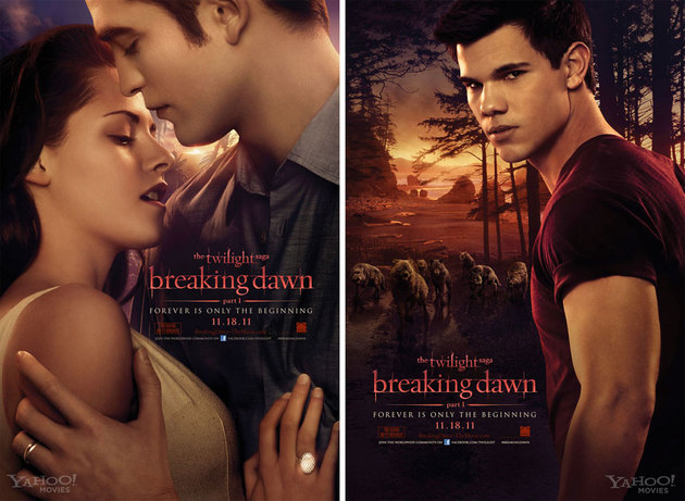
And not to be outdone, the Big Three: Bella with her glowing new wedding ring (on the wrong finger, but whatever, just as long as you know that smooth complexion and lusty sternum-ward gaze are those of an honest woman), Edward with his own wedding band and "Is it in?" blues, and Jacob pensively off to explore the other interspecial relations that The Twilight Saga has been building to all this time -- all in front of a sky hemorrhaging orange juice.
But: Forever is only the beginning, everyone! What will they think of next?
Follow S.T. VanAirsdale on Twitter.
Follow Movieline on Twitter.

Comments
Whoa, time out. Why in the hell did they Photoshop Peter Facinelli to look like Corey Feldman?!
OMG!! I can't wait to not see this.
These posters always looked like Abercrombie & Fitch or porno promos to me.
You win internet today.