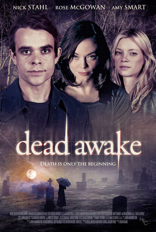
Move Over, Gun: We've Found the Year's New Worst Movie Poster
Well, that was fast. Mere days after Gun's heavily armed 50 Cent appeared to sprint away with the honor of the year's most unfortunate movie poster, along comes the thriller Dead Awake to overtake that lead. I know, I know: What the hell is Dead Awake? You mean other than awesome?
An IMDB storyline goes like this:
Dylan, a young man working at a funeral parlor, is trying to unravel a mystery that shattered his life ten years earlier. After faking his own funeral to see who will show up, he befriends a mysterious street junkie and is reunited with an old love from his past. The lives of these three characters are transformed by supernatural forces as Dylan discovers that no one is who they seem to be.
Judging by the looks on the faces of Nick Stahl, Rose McGowan and Amy Smart, I think those supernatural forces might derive from the evil spirit Photoshop from planet Adobe. (The DVD cover is just about as troubling.)Anyway, this movie opens today on 55 screens; call your shots on opening-weekend box office below.
 Subscribe to the new Movieline on YouTube
Comments
The title's font and design scream _Twilight_. The photoshopping screams intern. Yet...it's still more compelling than the trailer Movieline posted recently.
This image haunted me from the side of a bus for 20 minutes in traffic a few weeks ago.
To be honest, I thought it was for another Twilight flick.
Also, based solely on that IMDB plot description, $20 says at the end it's revealed he was dead the whole time!
The side of a bus! This is a much more ambitious campaign than I ever would have thought.
King's Speech still wears the crown.
Right? I'm pretty sure I saw a billboard, too. Kickin it Wiseau-style!
"I see cardboard cut-out people."
Am I crazy or is Rose McGowan slowly morphing into a Bethany Frankel lookalike?
None of these people look like these people.
You're cray cray. Also it might have to do with the 2007 car accident in which her face was pretty badly injured?
What about this one for The Adjustment Bureau?
http://www.impawards.com/2011/adjustment_bureau.html
MATT DAMON
It's like they tried to make each of these actors look as shitty as possible and then slapped Twilight's font on there just for an added measure of crap.