2010: The Year Movie Posters Were Afraid of Their Stars
 Inception
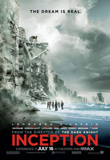
Leonardo DiCaprio had a sizable hit this year in Shutter Island, so how did the Inception one-sheet take advantage of that? By shrinking him down to microscopic size and letter-spacing out his name so much that it's virtually unreadable. Then again, he shouldn't take it personally. Inception may have a starry, Oscar-friendly cast, but WB was only concerned with selling two things: spectacle, and that crucial credit of "From the Director of The Dark Knight." Who can blame them, since it's clearly worked?
 Percy Jackson and the Olympians: The Lightning Thief
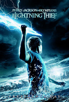
Kids may have known what this property was, but adults didn't -- and that one-sheet didn't help any. Sure, star Logan Lerman's not exactly a name yet, but there were a bunch of actual stars (among them Pierce Brosnan and Uma Thurman) that the studio wasn't selling, either. By obscuring Lerman's face and, thus, his age, perhaps marketers wanted to keep things vague enough to intrigue an older demographic. Instead, it didn't hook anybody.
 Never Let Me Go
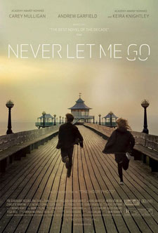
Never Let Me Go was lucky enough to hit a casting jackpot: Not only does it have a proven star in Keira Knightley, but Carey Mulligan was nominated for an Oscar a few months ago, and Andrew Garfield was just anointed the new Spider-Man. Still, all three were forsaken for this arty image of a pier. What, do they think this movie stars Jennifer Connelly or something?
Pages: 1 2
 Subscribe to the new Movieline on YouTube
Comments
I had the same WTF reaction to the Scott Pilgrim poster. Maybe Universal is branding this as the completion of the Michael Cera Plays An Instrument In At Least One Scene trilogy.
My favorite poster was the one for Salt, which eschewed Jolie's pouty lips for a can of Morton's.
Well, AJ's face was full view on the Salt posters on our busses and in the newspaper. Give the studio credit for featuring her as the star front & center.
You know, Movieline, sometimes you guys seem a little desperate for a story. I see your point with Knight and Day. I don't remember last time Cameron Diaz was a big draw either. But INCEPTION and Scott Pilgrim and even Buried are films where there is either a huge concept being sold, where that is the draw, or like with Scott Pilgrim, most who are going to see it already know what it is.
Also, every other time there are stories about movie posters, it's ridiculing the dreaded "floating heads." I just happy these posters take a bit of a chance. I used to collect posters for designs like these. But again, Knight and Day, that's just not even a good design. That's like someone downloaded a couple Photoshop brushes from Deviant Art and went to town.
I was wondering if I was gonna be the one to say this, surprised I'm the first.
The Scott Pilgrim poster looks the way it does intentionally, it's almost an exact recreation of the title page from the comic books. I don't really think it's doing much to avoid Michael Cera's connection or the trailers so far wouldn't have focused so heavily on him or played up the Michael Cera-ness of a character that's not very Michael Cera-y.
http://img5.imageshack.us/i/002003.png/