2010: The Year Movie Posters Were Afraid of Their Stars
There's been a lot of anxious chatter lately about how star power isn't what it used to be, but when studios pony up big paychecks to land those stars, you'd still expect them to show off their expensive assets on the poster. In 2010, however, the rules have changed. Here are six posters with big stars or big budgets that kept those famous faces off the one-sheet.
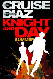 Knight and Day
When Knight and Day underperformed at the box office, Fox marketing head Tony Sella fell on his sword, telling the LA Times, "Blame me, don't blame Tom Cruise." Why not spread the wealth? Cruise certainly didn't do the marketing team any favors by alienating the audience the film hoped to attract, but the silhouetted stars on the poster tacitly admit defeat. This poster doesn't scream "Saul Bass" as Sella said it was intended to -- instead, it says, "We know you're not interested in our movie star, and we don't blame you."
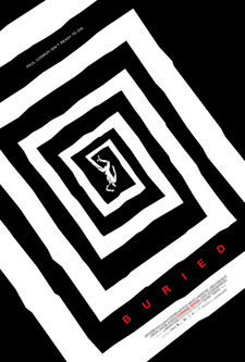 Buried
On the other hand, the poster for Buried does pay homage to the simply stark designs of famed graphic designer Bass, though it does so at the expense of star Ryan Reynolds (who doesn't even get so much as an above-the-title credit). Unlike Cruise, Reynolds is a star on the upswing with few negatives, but in this case, we're living in a post-Paranormal Activity world, where the low-fi, high-concept nature of the film is its main selling point. (Also, Lionsgate's Tim Palen never met an arty teaser poster he didn't like.)
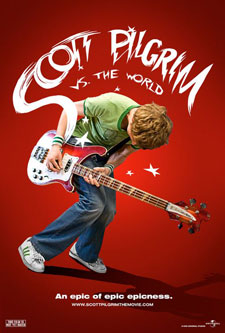 Scott Pilgrim vs the World
Is Universal worried about a Michael Cera backlash? Sure, anyone already familiar with the movie can recognize Cera's shape, but it's notable how hidden his face is on the one-sheet. Then again, this is one of the more head-scratching posters of the year; Scott Pilgrim is a hyperkinetic, videogame-drunk action comedy, but the one-sheet studiously avoids conveying any of that. Even Comic-Con visitor Michelle Rodriguez was stumped.
Pages: 1 2
 Subscribe to the new Movieline on YouTube
Comments
I had the same WTF reaction to the Scott Pilgrim poster. Maybe Universal is branding this as the completion of the Michael Cera Plays An Instrument In At Least One Scene trilogy.
My favorite poster was the one for Salt, which eschewed Jolie's pouty lips for a can of Morton's.
Well, AJ's face was full view on the Salt posters on our busses and in the newspaper. Give the studio credit for featuring her as the star front & center.
You know, Movieline, sometimes you guys seem a little desperate for a story. I see your point with Knight and Day. I don't remember last time Cameron Diaz was a big draw either. But INCEPTION and Scott Pilgrim and even Buried are films where there is either a huge concept being sold, where that is the draw, or like with Scott Pilgrim, most who are going to see it already know what it is.
Also, every other time there are stories about movie posters, it's ridiculing the dreaded "floating heads." I just happy these posters take a bit of a chance. I used to collect posters for designs like these. But again, Knight and Day, that's just not even a good design. That's like someone downloaded a couple Photoshop brushes from Deviant Art and went to town.
I was wondering if I was gonna be the one to say this, surprised I'm the first.
The Scott Pilgrim poster looks the way it does intentionally, it's almost an exact recreation of the title page from the comic books. I don't really think it's doing much to avoid Michael Cera's connection or the trailers so far wouldn't have focused so heavily on him or played up the Michael Cera-ness of a character that's not very Michael Cera-y.
http://img5.imageshack.us/i/002003.png/