Look, there's no point in getting upset about classic film remakes. They're going to happen whether we want them or not, and the odds are stacked enough against anyone who attempts it. We'd all rather they were good or at least carried off with the right spirit. The filmmakers don't need the added challenge of working in the echo of an Internet chorus shrieking defensively about how sacrosanct the original movie is. I even feel this way about Rod Lurie's remake of Straw Dogs, the still-troubling 1971 revenge saga by Sam Peckinpah. Good luck, Rod, don't let us down, etc. But then there's this poster, which is like, really?
For our purposes, I will go ahead and match it up against the original film's poster, since that's the comparison Sony is inviting anyway (click for bigger):
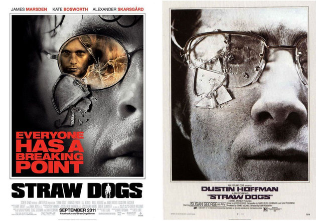
A few things:
· Photoshop is one of mankind's great technological advances in the four decades since Peckinpah made Straw Dogs. But like any powerful tool, it can be deadly when it winds up in the wrong hands. Here, the superimposition of Alexander Skarsgard's face in the shattered lens of James Marsden's eyeglass frame is the marketing equivalent of a smoldering van full of explosives in a public thoroughfare. It looks bad, and it portends worse. And in sepia tone! Even my mom knows better than to reproduce digital images in sepia tone! The reason the broken glass works in the older poster is because you can make out the faint dimensions of Dustin Hoffman's eye. It implies peril, danger, imminent threat. He -- not the bad guy -- is looking at you. Intimacy and violence are the selling points, which is what makes Straw Dogs disturbing still, even after all these years.
· The tagline, I mean, come... on. No shit, everyone has a breaking point. I wouldn't be surprised if Screen Gems HQ is littered with balloons and confetti and all the other festivities resulting from being the 1,000,000th organization to use that cliché as a marketing hook. All it does is suggest to the potential viewer how one more terrible movie poster can push you over the edge. Exhibit A: [Author points to self. With gun.] Trust the viewer. Lose the goddamn tagline.
· James Marsden is not Dustin Hoffman. We know this. Still, he is your leading man. We will be spending a bit of time with him, so how about a proper introduction and show us a little more of his face? And dry it off! He looks like he just reached the breaking point of a fever.
· The mouth is all wrong. First of all, it's, uh, open -- an idle gape of equanimity. This is not the jaw-clenching visage of a man whose wife was just raped by the sepia-toned menace lurking in his spectacles. (Or maybe it is? Maybe sepia is the new rape-rape. I can't keep any of it straight. Thanks for nothing, Roman Polanski.) Close the mouth!
· You there! Yes! You in the "O"! Get out of my vowel!
· If Tyler Perry can get these marketing concepts right in a Straw Dogs homage, why can't the studio get them right for a Straw Dogs remake?
[via Awards Daily]