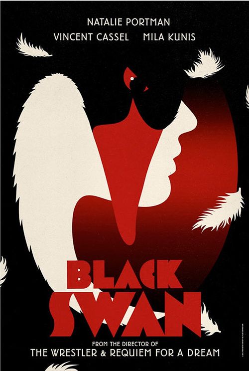
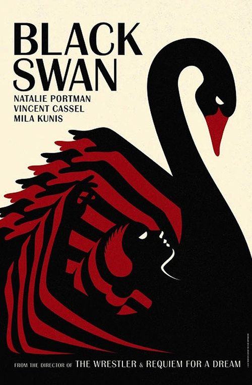
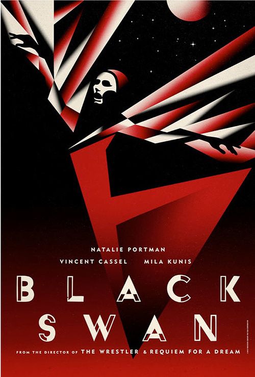
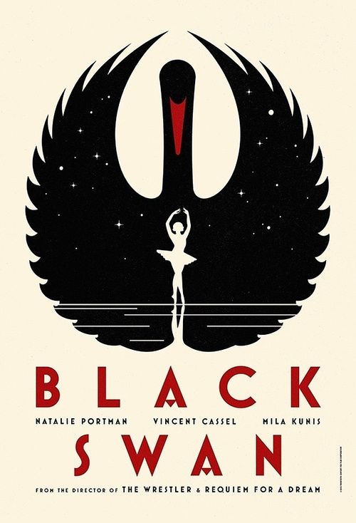
Spoiler of the lowest order: Black Swan is chockablock with obvious swan imagery and a black/white motif that swallows the movie -- even if the photography itself is swoon lake. (Laff.) But unless you're hungry for psychodramatic, meth-level convulsions, you can actually glean the best parts of Black Swan through these new posters by design firm LaBoca. Check out their sanguine splendor after the jump.
I'm a sucker for book cover illustrations of the '60s and '70s (which were also gleefully referenced in an episode of Work of Art this year), so the crisp colors speak to me in a way A Wrinkle in Time might have in my youth. The feat here is how these posters nail balletic form, grace and precision in a way the movie doesn't -- with simplicity, curvy lines, and saturated polychrome. The actual Black Swan is sterilized drama where the whites are never milky and the blacks are never deep -- and that's a conscious choice, no doubt, as coldness pervades the character stories. But these drawings pinpoint the resounding theme of "perfection," which the movie is supposed to do ahead of its finale and, ultimately, doesn't. If you haven't seen Black Swan yet, maybe you should bring these pictures with you to the theater to ensure a sumptuous literary experience.
'Black Swan' Posters [Jezebel]